Color and Space
“The rays of colours are original and immutable.”
Isaac Newton “Optiks”, 1704
As someone who has been deeply interested in color and its impact on the spaces we inhabit, it felt natural to dedicate my final research project at NC State University (completed in Spring 2025) to exploring the psychological effect of color in the home. In this article, I want to share a refined and accessible version of that work. The full academic paper will be available through a link at the end of this post for anyone interested in reading it in its entirety.
Color as Part of Human Experience
Color is one of the first ways we understand the world. It stimulates our senses, communicates meaning, and shapes our emotional responses. We instantly distinguish lemons from limes because of color. A red stop sign warns us from afar before we even see the text. A bright NC State hoodie announces school affiliation before any logo is visible.
These everyday examples reveal something profound:
color communicates faster than language — and without needing explanation.
In interiors, color is not simply visual decoration.
It influences sleep, focus, productivity, comfort, and emotional well-being. Bedrooms are especially sensitive to color because they support rest and reflect identity.
To understand why color behaves differently from room to room, it is essential to look not only at its emotional associations but at the science behind it.
History and Science behind Color
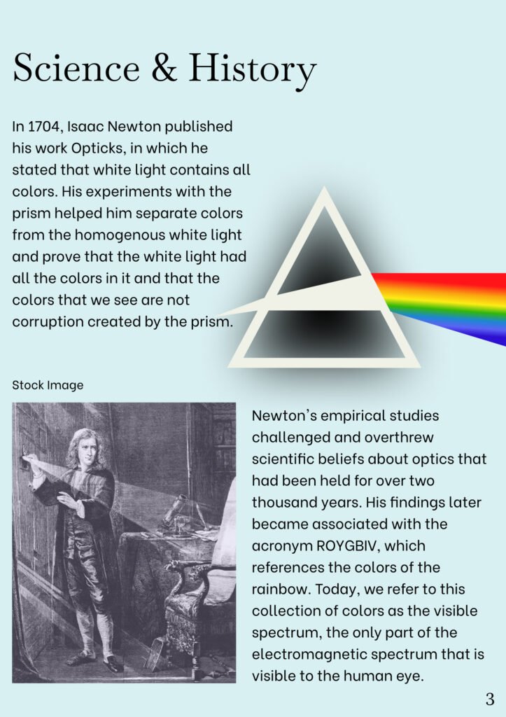
Much of our modern understanding of color began with Isaac Newton’s 1704 publication Opticks, in which he demonstrated through prism experiments that white light contains all colors. Newton famously wrote that “the prism does not change light; it only separates its colours,” and that “light is a mixture of rays of all colours.” His work established that colors are not inherent properties of objects but of the light they reflect. This insight is fundamental to interior design: the same paint color will shift dramatically depending on the quality, intensity, and direction of available light. A blue that appears crisp and bright in a south-facing room may seem muted and gray in a north-facing room. Colors change through the day and across seasons, responding to morning warmth, afternoon coolness, or low winter sun. A color is never a fixed entity; it is a dynamic relationship between surface and light.
Because of this, room orientation plays a critical role in how color is perceived. North-facing spaces often read cooler and require warmer hues to feel balanced, while south-facing rooms receive generous natural light that can support a wide range of colors, including cooler tones that might feel dull elsewhere. East-facing rooms glow warmly in the morning and fade into cooler light later in the day, while west-facing rooms experience the reverse, shifting from subdued mornings to rich, golden evening light. The emotional effect of color is inseparable from these lighting conditions.
Psychological Impact of Color
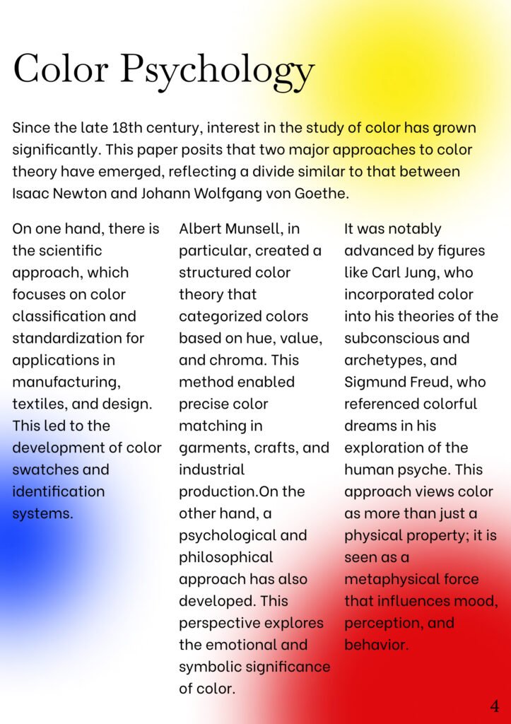
The psychological impact of color has been discussed for centuries by philosophers, psychologists, and designers alike. Johann Wolfgang von Goethe explored the emotional nature of color, associating hues with moods and states of mind. Later, Carl Jung connected color with symbolism and the subconscious, suggesting that color is tied not only to perception but to deeper psychological resonance. Modern research echoes many of these early ideas: blues and greens tend to calm and restore, yellows can uplift and energize, reds stimulate alertness and intensity, and darker hues create intimacy and depth. These reactions are not superficial; they influence heart rate, focus, anxiety levels, and the overall atmosphere of a room.
Our relationship with home has changed significantly since the pandemic, with millions of people working remotely. According to the U.S. Bureau of Labor Statistics, about 35% of U.S. workers worked from home in 2023. With so much of life happening indoors, the way color shapes mood and focus has become even more important. A simple shift in paint color can make a room feel warmer, larger, cleaner, or more serene without replacing a single piece of furniture.
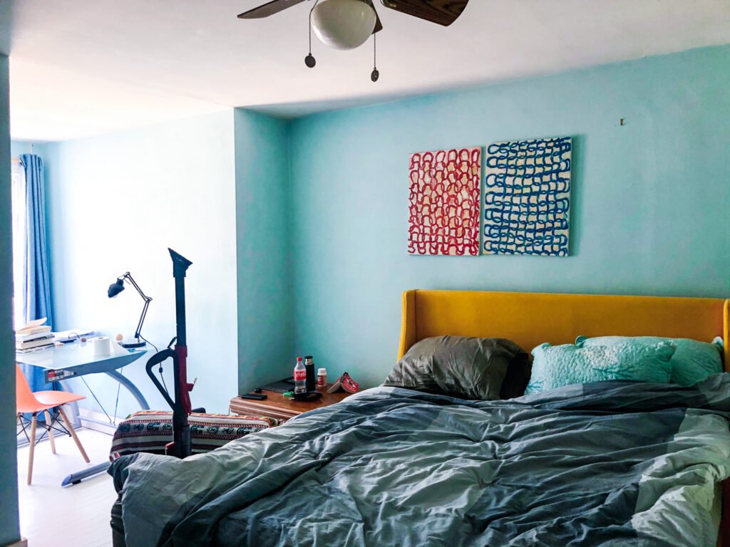
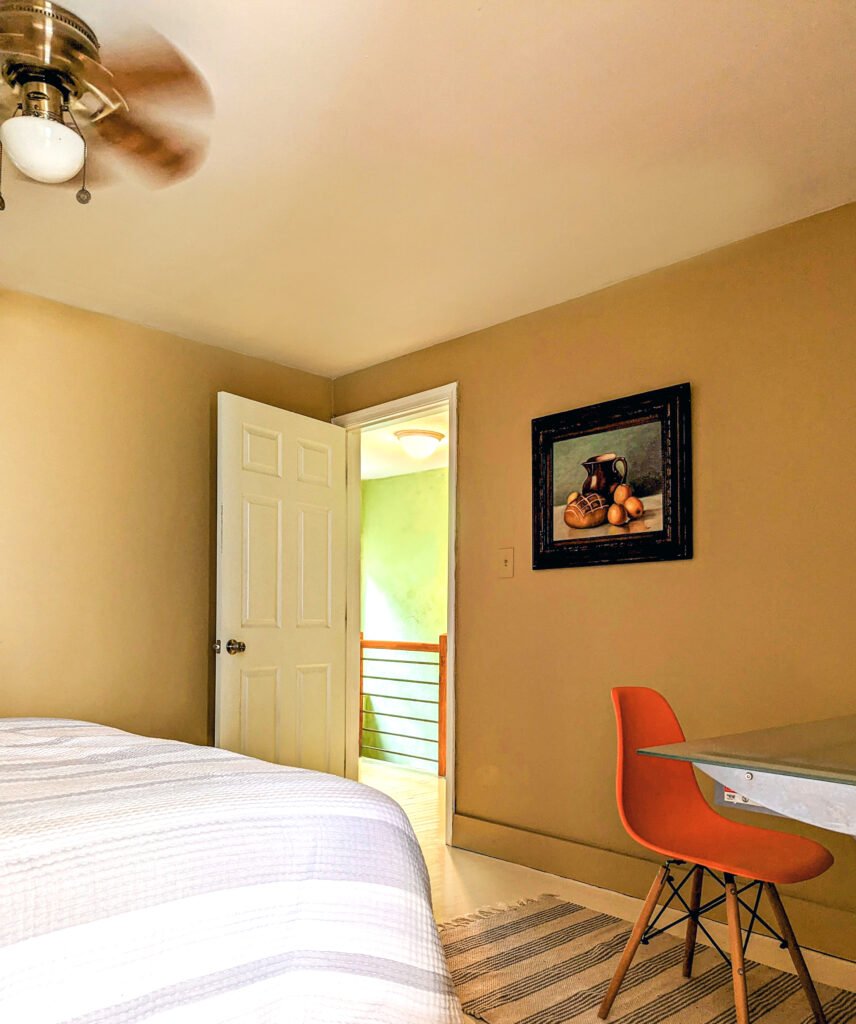
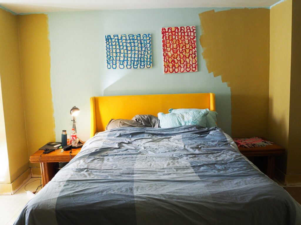
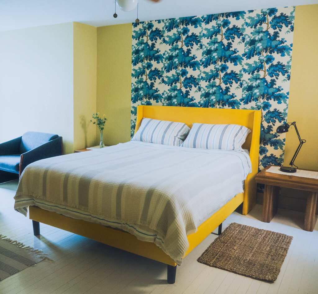
I have experimented with color and light for many years, both in my own home and in the homes of clients. In my house, the north-facing bedroom was originally painted in one of the cooler blues by Valspar, and later I repainted it in Sombrero by Benjamin Moore—a warm, gold-toned color that dramatically changed the atmosphere of the space. This outcome highlights the core of the argument: color alters our perception of space because it alters how light behaves within it.
Summary
In conclusion, color plays a vital role in shaping emotional well-being and the functional quality of interior spaces. It can energize or soothe, expand or contract, warm or cool, simply through its interaction with light and our psychological responses. A fresh coat of paint—applied to the same walls, paired with the same furnishings—can revive a space and reshape the way we feel in it. Color is one of the most accessible tools we have for improving our homes, and its influence extends far beyond aesthetic preference. This article shares only a glimpse of my research. If you would like to explore the full paper, including historical context, color theory, and detailed case studies, you can find the complete version through the link provided.